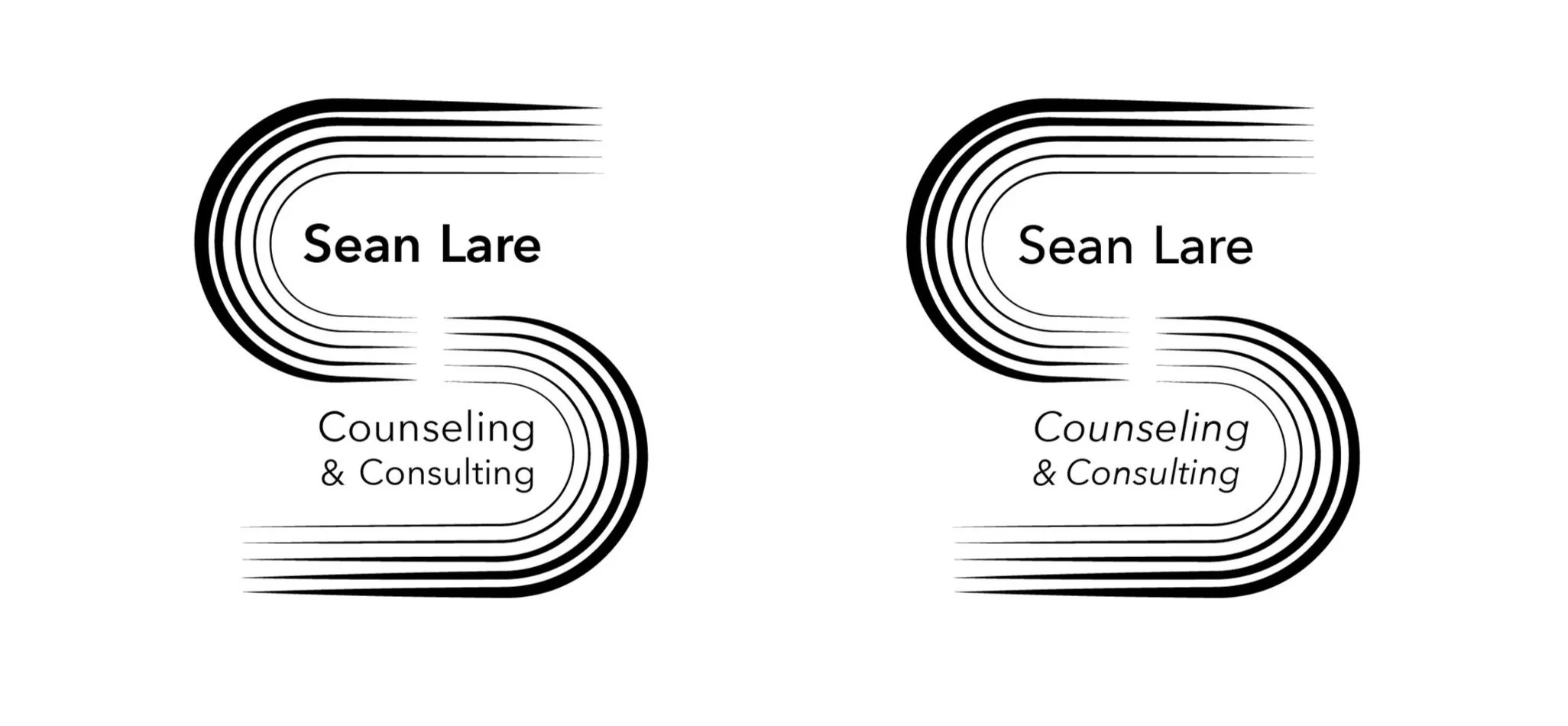
Sean Lare: Counseling and Consulting
A logomark for a business that focuses on providing counseling and consultations to members of the LGBTQ+ community, specifically those who identify as trans or non-binary.
Concept/Sketches
Ideated various ways to represent the LGBTQ+ community, sketching different ways of abstracting a traditional rainbow. Explored how to communicate the idea of a “helping hand” in an abstract manner.
Typographic Selections
The client wanted a typeface that was clean and simple like the original logo. Searched for typefaces that were clean, legible, and would bring in the curves that would be reflected by the rainbow arcs within the logo mark.
Digital Iterations
Transferred the sketches the client felt aligned best with their vision and began to construct them in Illustrator. Started to explore movement by incorporating different line weights and profiles.
Digital Iterations Phase 2
These three iterations were the strongest in communicating the idea of motion. Iterated further to finalize which worked the strongest compositionally along with the type.
Color Iterations
It was important to highlight trans and non-binary individuals within the logo as that would be majority of the clientele. The colors chosen are from the trans and non binary flags. Experimented with different ways to incorporate these colors in each iteration.
#16D8F2
#FCA4DA
#F4F408
#783AC1


